Before & After: 70s Kitchen Makeover on a Budget
This post may contain affiliate links · This blog generates income via ads
Need some inspiration to renovate your old kitchen? Here’s how we did a 70s kitchen makeover for my brother and sister-in-law… on a budget!
Do you need some DIY kitchen renovation inspo? I can’t wait to show you the before and after of my brother’s 1970’s kitchen remodel. It’s was a month of hard work! We completely made over the original kitchen and my brother and sister in law’s home.
My brother Nathan and his wife Ashley live in a 1970s home with tons of original features and even more potential. You might remember this sweet nursery I designed for them!
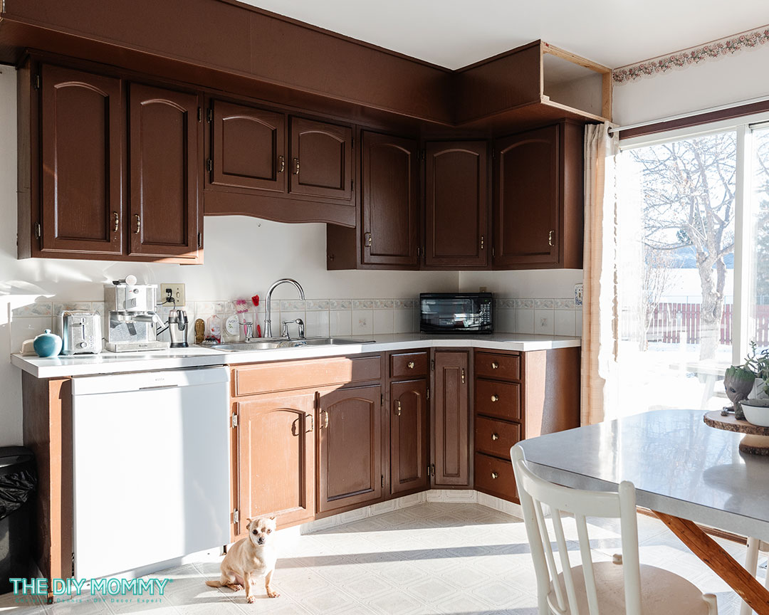
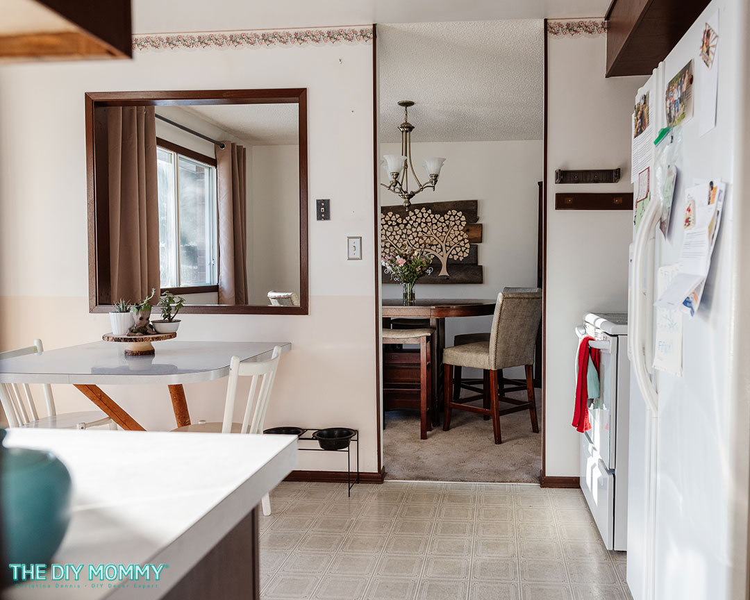
Here’s how their kitchen looked before:
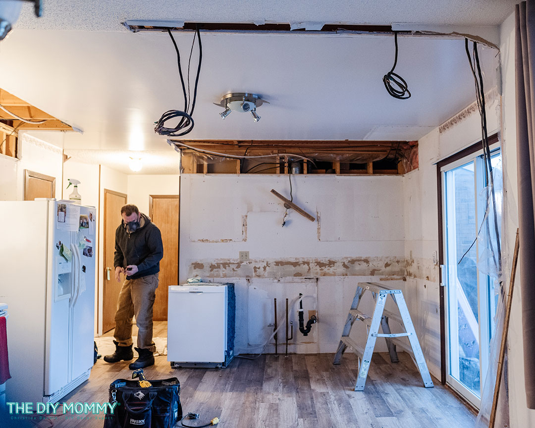
It had all its original cabinetry and flooring, and there’s also a passthrough between the dining room and the kitchen. We wanted to give them updated cabinetry with more storage.
We also wanted to remove the large bulkheads that make the room feel smaller than it actually is and really open up the kitchen by removing that dining room wall. I would love to give them a modern island and a lighter and a brighter look for this space.
Watch my video to see this kitchen renovation from start to finish:
Note: this video was sponsored by Home Depot Canada, and they provided many of the products for this kitchen renovation for free to Ashley & Nathan.
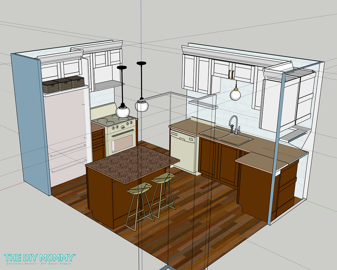
The plan
My sister-in-law wanted dark wood tone cabinets so they’re easier to keep clean. As much as I love a classic white kitchen, we thought that a two tone look with both white cabinets and brown cabinets could work in this space. We opted to use shaker style cabinets and brushed gold lighting and hardware for a transitional look.
As for the layout, Ashley and Nathan wanted to swap their fridge and their stove so the stove was away from the corner and near the pantry. Plus, we convinced them to remove the wall between the kitchen and the dining room for a more open and modern look. An island in the middle of this space will add extra seating and storage.
The demo
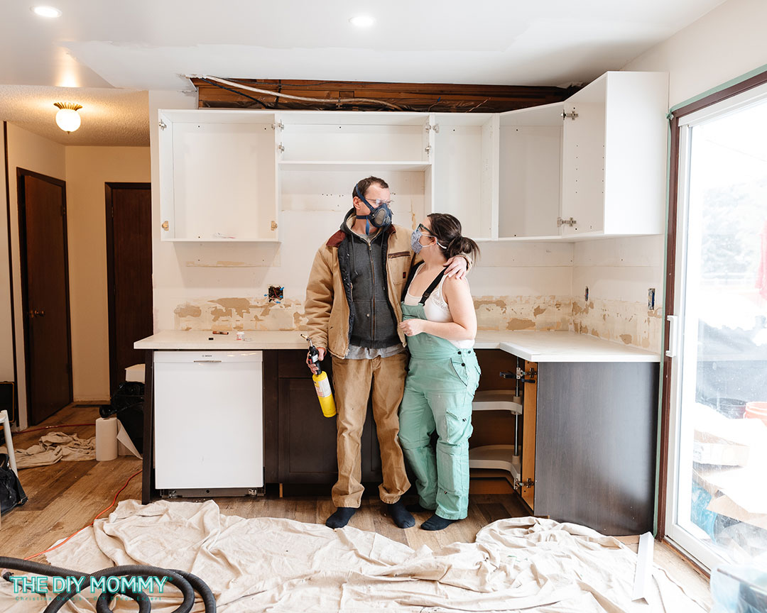
To begin, we removed all of the old original cabinetry and knocked down the wall between the dining room and kitchen. My husband Sean is an electrician and general contractor, so he was able to help me get this done safely.
After the demo, we re-routed any electrical and plumbing that needed to be changed. We also had my brother install new flooring in this space that matches the rest of the flooring he’s installed in the rest of his home.
Next, Sean and I put up new drywall, and we primed and painted it a soft white colour called Swiss Coffee by Behr. You can find all of my favourite Behr white paints (and how to choose one for your space) right here!
The 70s kitchen makeover
Then, we installed the new cabinetry. These are pre-assembled kitchen cabinets (Hampton Bay Edson) from Home Depot Canada, so they’re affordable and so easy to install.
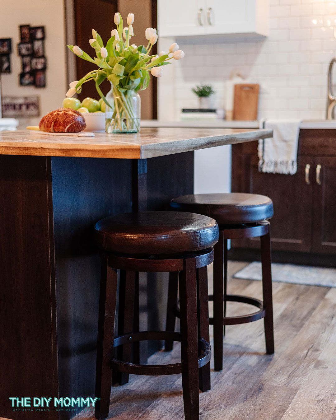
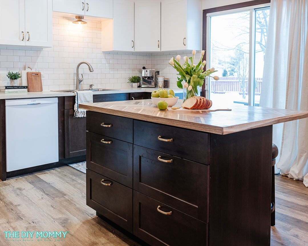
To create an island, we used a couple of 30 inch wide base cabinets and mounted them together with some screws. We used a couple of the dark wood coloured cabinet cover panels to hide the backs of the cabinetry.
Next, we installed a light coloured Formica laminate countertop, which is a really durable and affordable choice for a kitchen counter. We installed this on the perimeter cabinets, and decided to go for a statement butcher blog counter on the island.
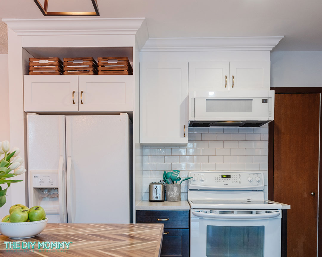
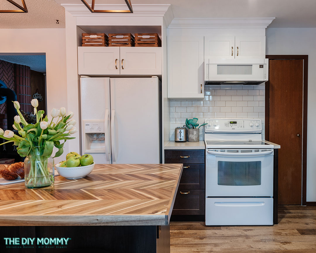
To make the refrigerator look more built in, we also grabbed a sheet of MDF to create a custom fridge panel. I painted it with paint that color matched to the white Hampton Bay cabinets. We made a simple box over the fridge from MDF and then painted it to match the upper cabinets. We used that as a little nook for baskets, which is also going to give Ashley and Nathan some extra storage.
Backsplash & trim work
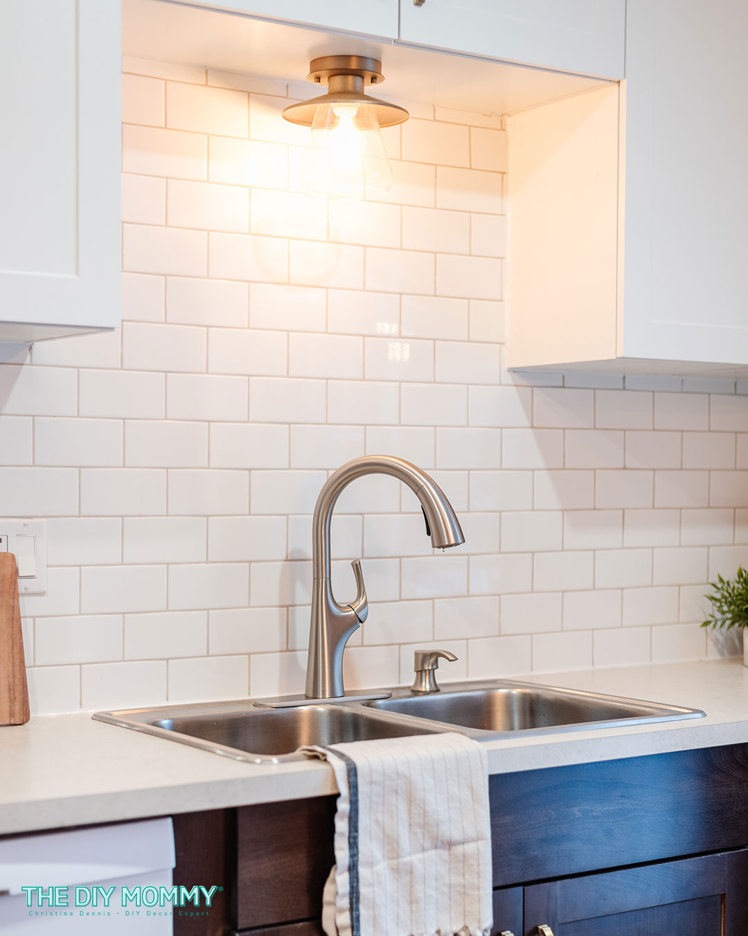
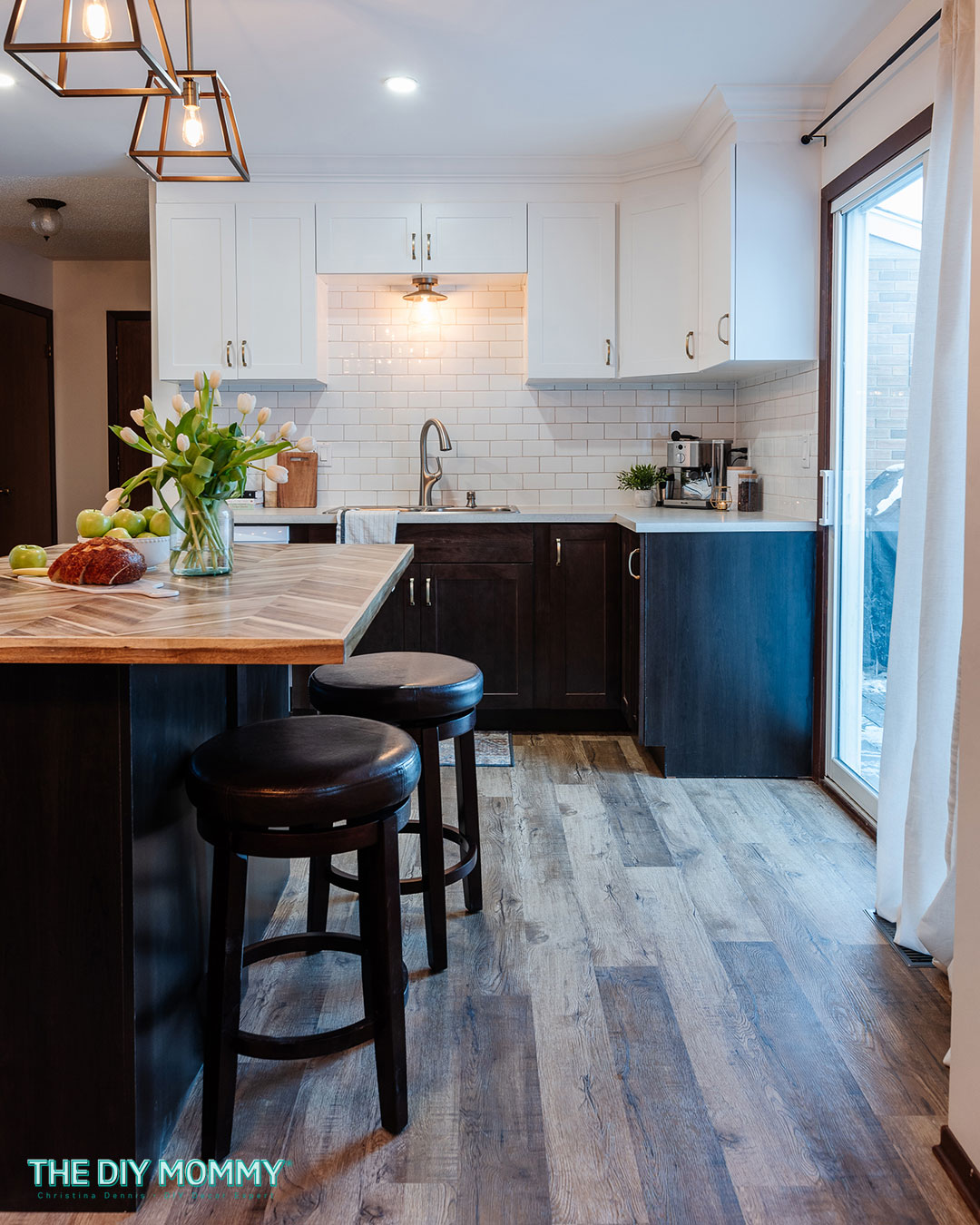
For the backsplash tile, we chose classic white subway tile for a timeless look. I think this really matches that transitional look of the cabinetry, the Shaker style, and it keeps this kitchen looking bright and open. Warm grey grout adds a little contrast to the backsplash.
We considered adding open shelves beneath the cabinets, however we changed our minds once we saw how beautiful and open the kitchen looked without them. My brother and sister-in-law are both tall, so they are able to easily reach and store anything in the upper cabinets. Open shelving can tend to be overwhelmed quickly with clutter, and the closed storage was important for Nathan & Ashley.
Now, we needed to cover up the space at the top of these cabinets. We mounted the cabinets six inches from the ceiling, so I painted some MDF to match the cabinetry and we installed it as a backer for some crown molding.
We then added crown molding to the top of the cabinet trim for a beautiful traditional touch. It makes this kitchen look more high end and gives it an illusion of height.
The hardware & sink
One of my most favorite elements in any kitchen design is a hardware. I don’t know what it is, but I have a thing for handles and knobs and the cabinet pulls we used in a beautiful champagne gold are gorgeous.
Here’s a quick tip for installing cabinet hardware: Create a jig or a pattern for where your holes need to go. I made mine with my cutting machine, but you could just use a simple ruler and scissors. This is going to make installing hardware so much easier and quicker!
Next, we installed a large stainless steel sink and faucet into the sink cabinet.
The fixtures & appliances
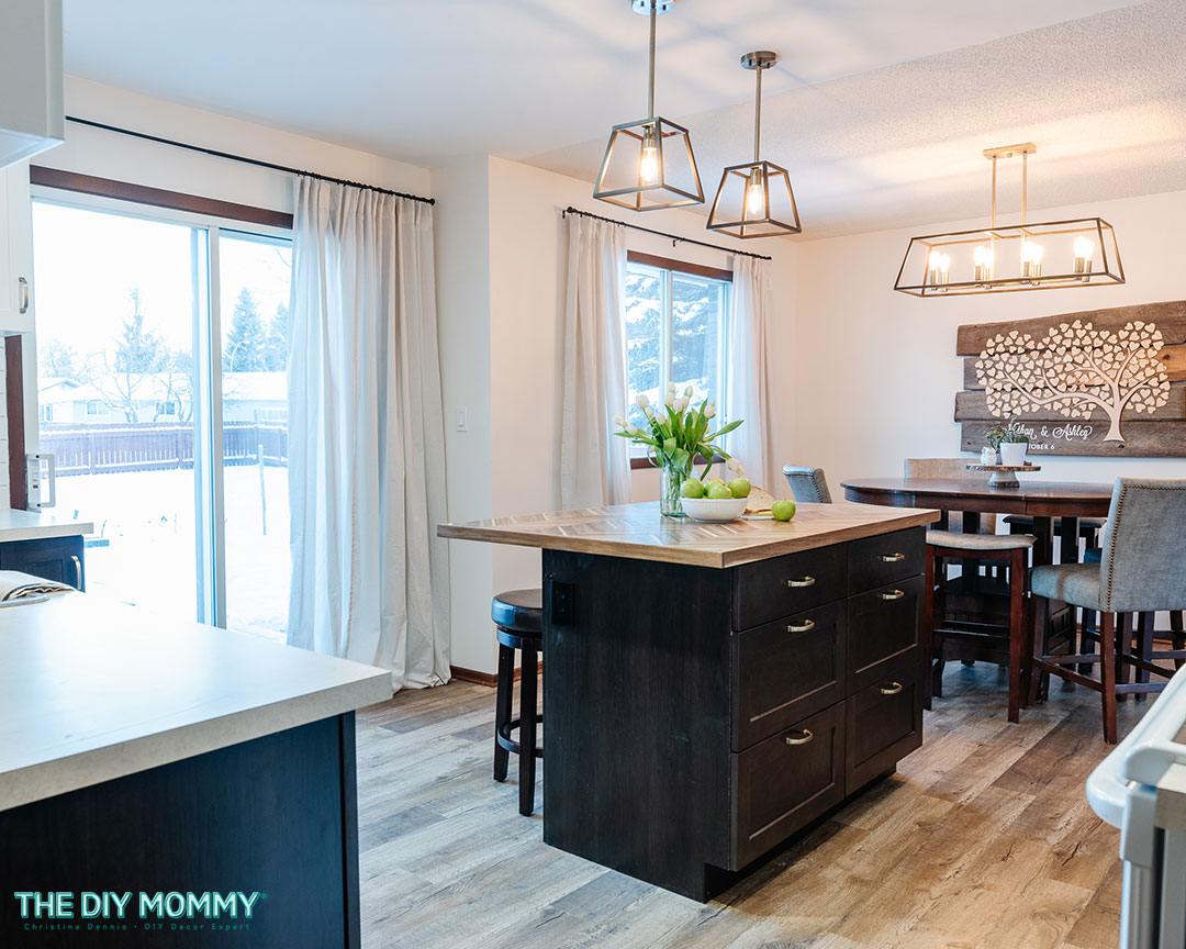
Then, we installed some transitional looking light fixtures with brushed gold details to update the space. Some pendant lighting over the island anchors the area. A semi flush mount fixture over the sink looks beautiful, but it’s also practical!
All of the appliances minus the microwave range hood and dishwasher came with the house. You don’t see too many white appliances used in new renovations these days, however I love how they look in this space. Reusing the appliances was also a great way to save money!
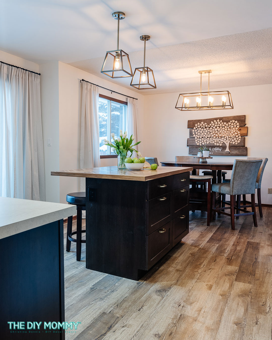
As finishing touches, I added new drapes to the patio door. These ones are a little sheer to allow some natural light to filter into the space from the door and large window in the dining room. This 70s kitchen makeover was now complete!
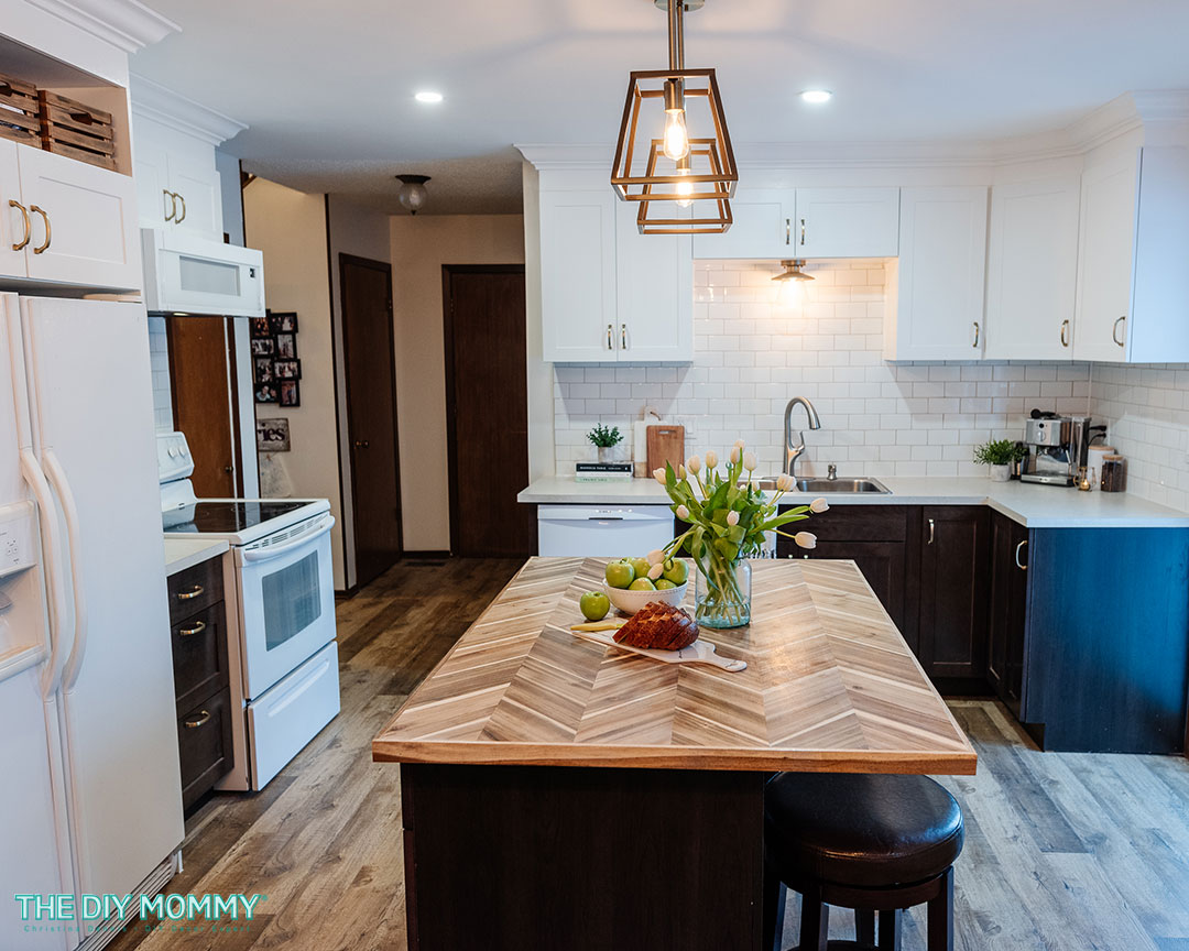
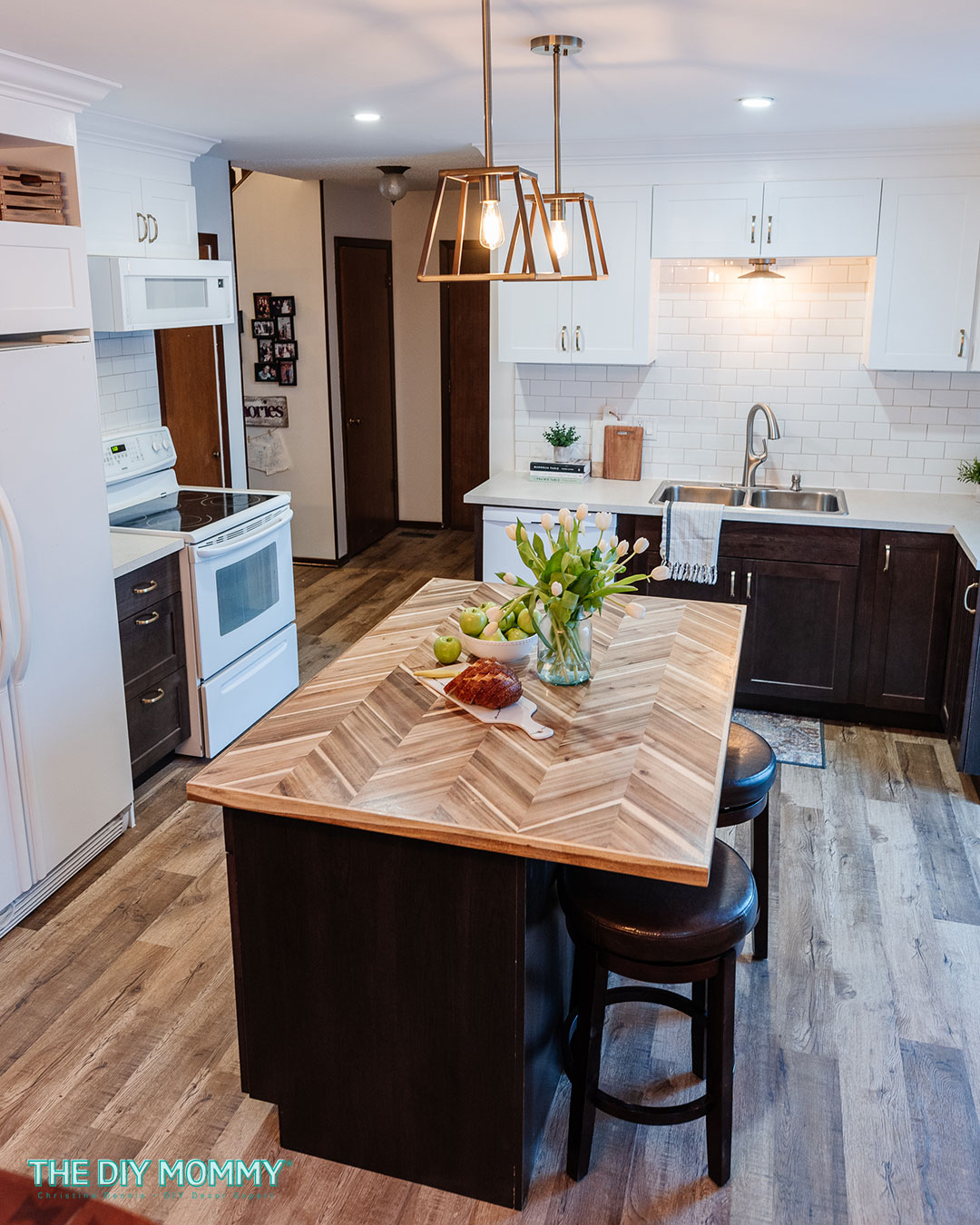
Here’s how the kitchen looks now:
I love that it has a mix of styles, both traditional and modern, with some rustic touches. I’ve always been a fan of two toned cabinetry. I think it really works well here to honor Ashley’s wish for darker cabinets, but keep that lighter look on top. I think the use of white uppers makes the space feel so much more open.
Removing the wall between the kitchen and dining area made this room feel so much bigger. And this island in the middle of the room is an absolute showstopper. It offers lots of extra storage for Ashley and Nathan and that amazing wooden countertop is a lovely feature in this space. It’s the perfect place for them to store cutlery, dishes, pots and pans.
I really like that this is an affordable kitchen design with the prebuilt cabinetry and the budget friendly finishes. However, we were able to make the kitchen look more custom with DIY elements like the fridge surround and this crown molding. I think the kitchen is so much more functional with the drawers and extra storage around the fridge. The updated lighting takes it to that next level.
The gold toned light fixtures and hardware keep this kitchen warm and friendly feeling, and the cabinets and laminate countertops are durable and perfect for this growing family. The subway tile backsplash is a classic that won’t date for years to come. I feel so grateful to have been able to work with my husband to give my brother and sister in law a fresh new kitchen. I truly hope they enjoy it for many, many years to come!
Let me know what you think of this 70s kitchen makeover in the comments below! I hope you found some inspiration here for your own kitchen renovation.

I think you knocked it out of the park!!