2022 Home Decor Trends that I CAN’T STAND!
This post may contain affiliate links · This blog generates income via ads
I’m just going to be honest – there are some 2022 home decor trends that I simply CANNOT get behind. Let me share them with you today and explain exactly why I don’t like them at all!
About a month ago, I shared my 5 favourite home decor trends for 2022. Curious to know what they are? Click right here! There are some beautiful, practical trends that I’m loving this year that I’ll be trying in family & friends’ homes this year, as well as our own.
HOWEVER, there are some trends that have been popping up that I’m not a fan of. Let’s chat about them!
LISTEN TO TODAY’S PODCAST FOR my LEAST favourite decor trends of 2022:
SUBSCRIBE TO MY PODCAST:
5 home decor trends for 2022 that I’m NOT loving
In no particular order, here are the newest decorating trends that I don’t care for at all. I’ll tell you why, and what I’d do instead! (Don’t forget: these are just MY opinions. If you love any or all of these for your home… have fun with them! It’s YOUR home! Decorate how ever you want regardless of trends.)
Curvy furniture
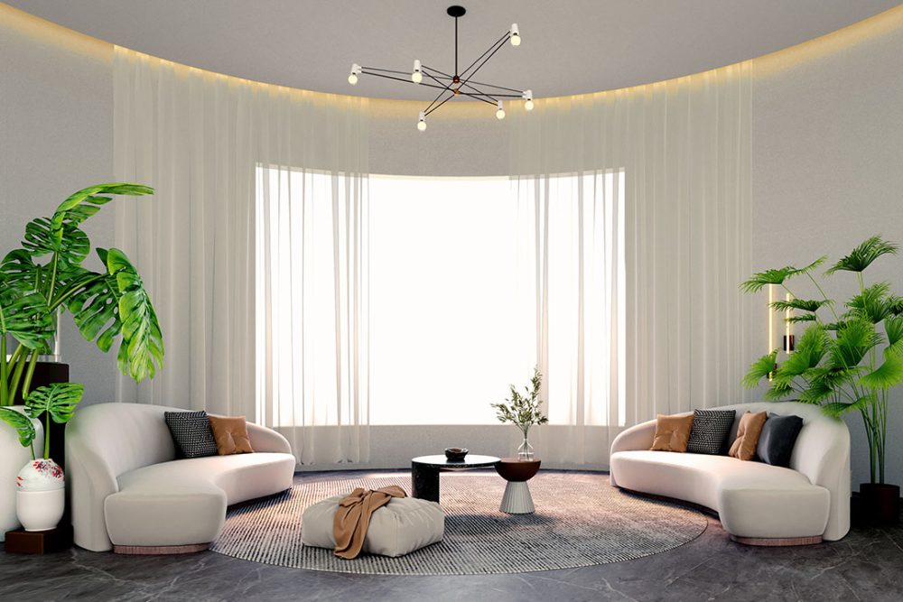
Rounded sofas, round tables, and even accessories like wavy candles have been popular this year. The look is very art deco inspired. In my opinion, curved furniture isn’t practical because it’s harder to fit in most (square or rectangular) rooms. Plus, if it’s overdone I think it can look overwhelming. The stock photo above shows two curved couches, a round coffee table, a round area rug, and several round planters. To me, this is simply TOO many circles!
Instead? I’d add in one or two curvy pieces to a room but have the rest be more square and structured. I think the contrast of curved to square is lovely. For example, one curved sofa in a room where all the other elements are rather square is a fun touch!
Indoor-look furniture in outdoor spaces
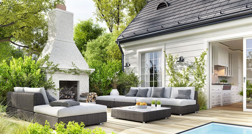
I love a gorgeously decorated patio, but the newest trend of bringing indoor furniture outdoors makes me shake my head. In our climate anyhow, having lots of soft and/or light coloured furnishings outside is impractical. I think of how much time I spend trying to store and clean my few grey coloured outdoor cushions, and it’s such a pain! The above stock photo isn’t actually TOO bad, but I still think the light coloured, large cushions would be an absolute hassle to keep looking good outside. I don’t want to call anyone out, but I have indeed seen actual indoor sofas out on a patio and I don’t know how those would look after a few months!
Instead? I’d keep ALL outdoor furniture easy to clean, wipe down and/or store. Mid-tone or darker cushions are easier to keep outside, and keeping the amount of textiles outside to a minimum is also so much more practical. You can still make an outdoor space feel cozy through the use of lighting effects and lush planters.
DIY textured walls
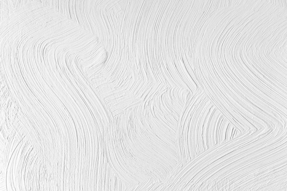
I love playing with textured paint (check out this textured DIY heart art), but the trend of texturing a whole wall with plaster or cement isn’t a favourite idea of mine. While it can look incredible and ultra modern, what about when this trend is OVER? Imagine trying to sand the texture off a whole wall? I think you’d probably have to rip the drywall down and redo it. I personally wouldn’t want to deal with this hassle!
Instead? If I wanted a textured wall effect I’d use peel & stick wallpaper, or I’d create oversized art panels that I can hang on the wall and easily remove later. With this trend, I think something more non-committal would be smart!
Sherpa or fur covered furniture
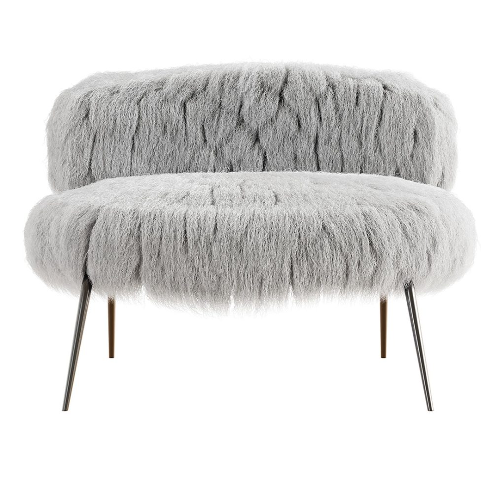
The reason I dislike the sherpa or fur covered furniture trend is also for practical reasons. While I’m a HUGE fan of soft, furry accents, I don’t know how a person could keep a fur-upholstered chair clean. Those white sherpa chairs look adorable in the store, but how would they look in your home after a few months of use? I find furry fabrics hard to clean, so I can only imagine how difficult it would be to keep a furry chair clean.
Instead? I’d drape a sheepskin over a chair for a similar effect. You can also add furry or sherpa textures into your space through simple throw pillows or blankets. Unlike a full chair, you can throw these in the wash (or send them to the dry cleaner).
Dark walls AND ceilings
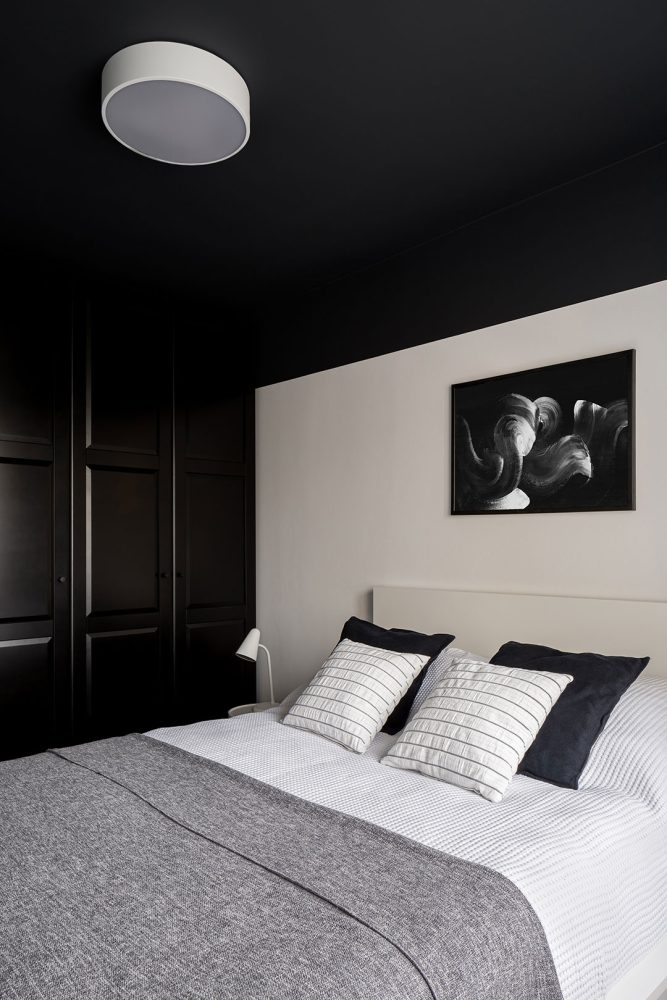
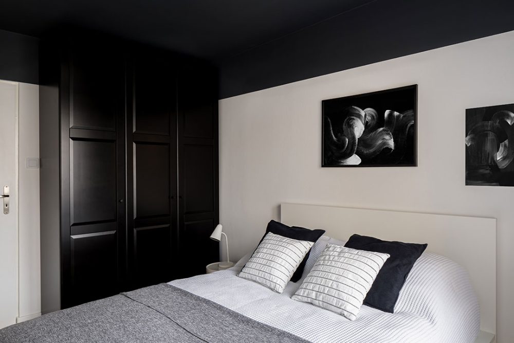
Black and dark paint colours are hot this year, and I DO like them. However, I’m not a big fan of the dark wall AND dark ceiling trend. Black paint can look ultra-luxe and feel cozy, but in my opinion have both a black wall and ceiling makes a room feel too small. I’m a little prone to clausterphobia, so I may be a bit biased! I much prefer light, bright spaces with little pops of black and dark accents.
Instead? I’d do a dark wall OR a dark ceiling, but not both.
THIS WEEK’S CHALLENGE:
What do you think of my least favourite home decor trends of 2022? Do you agree with me, or do you have a different opinion? I’d love to know down in the comments!

Awesome podcast. Totally agree that every one if these trends has a doable option but to fully embrace…. nope not for me either.
I don’t like any of these trends either but the curved sofa brought back fun memories of sleeping at my grandparents house in the 60’s. We visited every summer and depending on how old and tall we were we might have had to sleep on the curved sofa in the living room. It was a curved corner piece. You had to sleep on your side and if you wanted to turn over you had to sit up and sleep the other way. Sweet memories. I love your videos and posts by the way.
I don’t care for any of those new trends either, but I don’t mind a dark (not to dark and definitely not black) feature wall. Your right, painting a ceiling that dark you would feel like your in a cave.
I agree, especially with the furry chairs.
I have to say, I absolutely agree with you on all points! I’ve thought the same things you have when looking at the trends you’ve highlighted here. I love looking at the latest trends, but always wearing my “practical hat”. And – I, like you, love light and bright. Love dark accents, but not dark rooms!
I completely agree with you on every point. Some of the reasons why you don’t like these trends are running through my mind when I see inspiration photos for these trends. Give me light, bright and cozy everyday of the week.
I really love how you used stock photos to illustrate these trends and not photos of rooms by other bloggers/influencers. I know other content creators use other people’s photos as examples and I remember hearing you say how that can be really hurtful. So I appreciate you doing it this way instead!
I haven’t changed the style in my home in 20 years except accessories and rugs and pillows. If it ain’t broke don’t fix it!
Retailers love it when someone expounds on latest trends.
Money in their pockets.
Board and batten is trendy here on Long Island. Also, light and bright which is your style— classic and classy. Love it!
I used to love country French but on the darker side. I’m in the process of changing to the above style and that’s why I love your channel. Thank you for sharing. ?